
Some fonts get drawn in a weekend. Sukoon took ten years. That’s not a typo, and it’s not a humblebrag from a foundry trying to sound precious about its work. It’s the actual timeline behind one of the most thoughtful type releases of 2026, and once you understand what went into it, the decade starts to make a lot of sense.
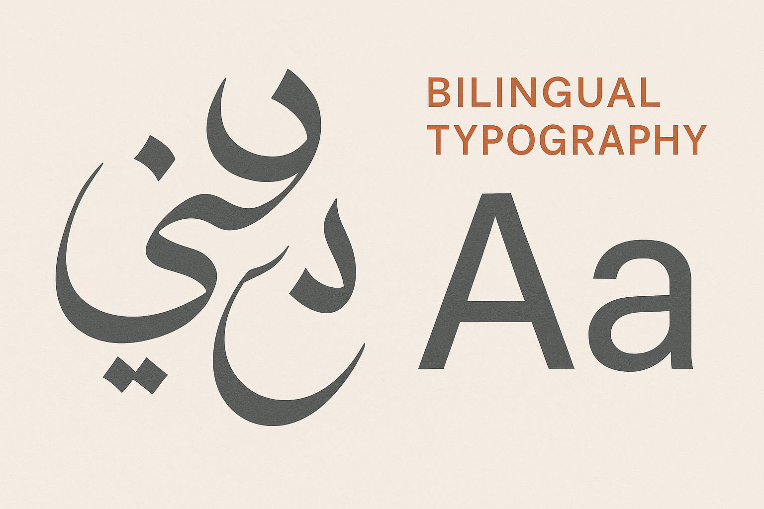
Fontwerk released Sukoon in late May, the latest addition to its library and, by the designer’s own account, the most personal thing he’s ever made. The font pairs Arabic and Latin scripts in a single humanist sans serif, and it covers a frankly absurd range of languages. If you care about type that works across cultures rather than just looking nice in a portfolio shot, this one deserves your attention.
Who made it, and why it took so longSukoon comes from Jan Gerner, the German designer better known by his alias Yanone. He’s been a familiar name in type circles for years, and Sukoon is his third Arabic typeface. He’s called it his personally most important work, which is saying something for a designer with a long track record.
The ten-year timeline isn’t an accident or a sign of procrastination. Designing a typeface that serves two completely different writing systems at the same quality is genuinely hard. Latin letters sit on a baseline and march along in tidy little boxes. Arabic flows, connects, and shifts shape depending on where a letter falls in a word. Getting both to feel like they belong to the same family, with the same personality and the same weight on the page, takes patience that most release schedules simply don’t allow.
The name itself tells you about the mood Yanone was after. Sukoon means silence, clarity, and inner peace in Arabic, and the word carries over into Persian, Turkish, Urdu, and Hindi too. He’s said the whole thing started with one quiet moment of contemplation. Ten years later, that feeling is baked into the letterforms.
What the font actually looks likeSukoon is a dynamic humanist sans serif. In plain terms, that means it has the warmth and movement of handwriting without tipping into anything fussy or decorative. For the Arabic, Yanone worked from classical Naskh proportions but gave them a humanist character and serious calligraphic fidelity, so the script keeps its traditional bones while feeling current.
The family runs from Thin all the way to ExtraBlack, which is a wide spread of weights. That range matters more than it sounds. A font that only ships in regular and bold limits what you can do. With everything from a whisper-thin Thin to a heavy ExtraBlack, you can build a full typographic system: delicate captions, punchy headlines, and everything between, all from one consistent voice.
Here’s the number that made me sit up: Sukoon supports more than 207 languages. That’s not marketing fluff. Building a Latin character set that handles 200-plus languages means drawing every accent, diacritic, and odd character that Vietnamese, Polish, Turkish, and dozens of other languages demand. Then you do it for Arabic too, and you make sure the two halves talk to each other.
This is the kind of work that goes unnoticed until you need it. If you’ve ever tried to set a bilingual sign, a multilingual app interface, or a global brand’s wordmark and watched the fonts fall apart the moment a non-Latin character appeared, you know the pain. A typeface that handles Arabic and Latin natively, at matching quality, saves you from stitching two mismatched fonts together and hoping nobody notices the seam.
Why this matters for web designers and developersIf you build for the web, multiscript type is no longer a niche concern. The internet’s fastest-growing audiences read Arabic, and serving them a clumsy fallback font is the digital equivalent of mispronouncing someone’s name at a party. It’s noticeable, and it signals you didn’t really try.
A font like Sukoon, with Arabic and Latin designed as one coherent system, makes right-to-left layouts behave. You get consistent vertical rhythm, weights that line up across scripts, and a single typographic personality whether the page is in English or Arabic. For anyone shipping products in the Gulf, North Africa, or any of the many regions where Arabic and Latin mix daily, that’s a practical upgrade, not a luxury.
The wide weight range helps here too. Families with lots of weights give you room to tune hierarchy and tone without juggling a pile of unrelated font files. Fewer mismatched fonts, cleaner code, happier load times.
There’s something almost rebellious about a ten-year typeface dropping in 2026. We’re surrounded by tools that promise to spit out a font in minutes, and plenty of people are happy to accept “fast and fine” over “slow and right.” Sukoon is the counterargument. It says some things are worth taking your time over, and that craft applied patiently produces work a shortcut never could.
That’s not nostalgia for its own sake. The reason Sukoon can handle 207 languages and make Arabic and Latin feel like siblings is precisely because someone spent a decade sweating the details. You can feel the difference between type that was labored over and type that was churned out. Readers may not be able to name it, but they sense it.
Should you actually use it?If you work on anything that crosses between Arabic and Latin, Sukoon should be on your shortlist. It’s a serious, professional-grade family from a respected foundry, and the multiscript design is the kind of thing you can’t fake. Even if you only ever set Latin text, the wide weight range and humanist warmth make it a strong workhorse for branding, editorial, and interface work.
For everyone else, Sukoon is worth knowing about simply as a reminder of what good type design looks like when nobody rushes it. It’s calm, it’s careful, and it earns its name.
So here’s my question for you: when was the last time you picked a font because it genuinely respected every language your audience reads, not just because it looked good in English? I’d love to hear how you handle multiscript projects, and whether a release like Sukoon changes how you think about it.

I'm a programmer at heart. But in my 20s, I realized there was more to the world of fonts than just Courier.
Driven by endless curiosity, I built a system to explore them.
That project grew into one of the world’s leading font identifier platforms: www.WhatFontIs.com.
By 2024, WhatFontIs is helping nearly one million designers—famous or not—discover the names of the fonts they need.

