Fifty-one years ago, a fifth-year art student in Warsaw drew a chunky display alphabet for a class assignment and called it Rugby. This week, Poland’s first type foundry put a finished digital version of it online and set the price at zero. That is the whole story, and it is a better one than most font releases get.
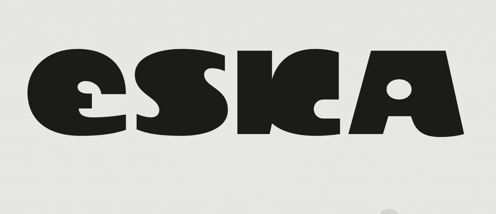
What Capitalics actually releasedOn September 1, Capitalics Warsaw Type Foundry published Eska, a display typeface in two flavors. Eska Original is a faithful digitization of the 1975 drawings. Eska Neue is a contemporary reinterpretation, cleaned up and adjusted for how we set type today. Both are free. You need a Capitalics account to download them, but there is no card, no coupon, no “free for personal use only” asterisk hiding in the license.
The digitization was led by Mateusz Machalski, Capitalics co-founder and one of the busiest type designers in Poland, with Małgorzata Bartosik contributing to the drawing work. Machalski started the project in 2025 to mark the typeface’s fiftieth birthday. It took about a year to get from archive to OTF, which sounds slow until you remember that the source material was a student portfolio, not a set of production drawings.

Maria Eska was a student at the Academy of Fine Arts in Warsaw in the mid-1970s. In 1975 she took a type design course run by Roman Tomaszewski, a central figure in postwar Polish typography who spent decades pushing for a homegrown type culture behind the Iron Curtain. Rugby was her course project.
Look at the letters and the name makes sense. The forms are round, heavy, and slightly cartoonish, with the kind of bouncy geometry you see on 1970s record sleeves and sports posters. It is the sort of alphabet that would have looked right on a Polish film poster or a magazine masthead of the era, which is probably exactly what a student in 1975 was imagining.
Here is the part I find quietly moving. Rugby never became a commercial typeface. It sat in a portfolio for decades. Most student projects from that period, in any country, simply vanish. This one survived because someone thought it was good enough to scan, and then someone else thought it was good enough to spend a year redrawing.
The revival that already happened, sort ofIf the name rings a bell, you might have seen BW Eska, a 2022 release by Bartosz Wesolek sold on YouWorkForThem. That font was explicitly “inspired by” Maria Eska’s 1975 design, and it is a fun, punchy display face with outline and italic styles.
The difference between that and what Capitalics just did is the difference between a cover version and a remaster. BW Eska takes the vibe and runs with it. Eska Original tries to preserve what Maria Eska drew, imperfections and all, and then Eska Neue asks what she might have drawn with today’s tools. Both approaches are legitimate. But having the foundry-grade, archive-faithful version available for free changes the conversation, because now anyone can compare the interpretation against the source.
Capitalics has form with this kind of thingThis is not a one-off for the Warsaw foundry. Capitalics has been steadily digitizing the Polish typographic canon for years. Bona, originally designed by Andrzej Heidrich in 1971, came back as Bona Nova. Brygada 1918 revived an interwar face. Półtawski Nowy modernized Adam Półtawski’s 1920s serif. Several of these were released free, often with support from Polish cultural institutions, on the reasoning that national type heritage should be accessible rather than locked behind a paywall.
Eska fits that pattern, but with a twist. The earlier revivals were of established, published typefaces by recognized designers. Eska is a student project by a woman whose name most people outside Poland have never heard. Choosing to treat it with the same seriousness says something about how Capitalics thinks about history: the canon is not just the famous stuff.
Why a free retro display font matters right nowThere is a practical angle here beyond the feel-good story. Seventies-flavored display type is everywhere at the moment. Bubbly, rounded, slightly psychedelic letterforms have been creeping back into branding, packaging, and editorial design for a couple of years, and the trend shows no sign of cooling. The problem is that most of the options are either expensive or generic. Plenty of fonts imitate the 1970s. Very few of them actually come from the 1970s.
Eska Original is the real thing, drawn by hand in 1975 by someone who was not imitating the era, just living in it. That authenticity is hard to fake and impossible to buy from a trend-chasing marketplace. And Eska Neue gives you the same character with the technical polish to use it on a website or a large-format print without fighting the outlines.
A few things I would use it for immediately: a music festival identity, a craft beer label, a podcast cover, or any headline that needs warmth without looking twee. I would not set body copy in it, and I suspect Maria Eska would agree.
What to check before you downloadTwo small caveats. First, the free download requires a Capitalics account, and as of this writing the fonts are listed with a standard foundry license, so read it once before using Eska in client work. “Free” and “unrestricted” are not synonyms, though in Capitalics’s case the two have historically been close. Second, this is a display face with a limited style set. Original and Neue, one weight each. Do not expect a nine-weight superfamily. That is not what this is.
What it is, is a small, honest piece of typographic history handed over for nothing, with the original designer’s name kept front and center. In a year when so much of the font conversation has been about AI generation, platform fees, and licensing disputes, a foundry spending twelve months on a student’s forgotten drawings and then giving the result away feels like a reminder of why people fell in love with type in the first place.
Your turnHave you ever tracked down the original of a typeface you thought you knew from a remake? And is there a forgotten student project or regional face from your own country’s history that deserves this treatment? Tell us in the comments, and if you set anything in Eska this month, we would love to see it.

I'm a programmer at heart. But in my 20s, I discovered there was a whole world of fonts beyond Courier.
Curiosity got the better of me, so I started building a system to explore and identify them.
What began as a personal project eventually grew into WhatFontIs.com, one of the world's leading font identification platforms.
Today, WhatFontIs helps nearly one million designers—from everyday creatives to some of the biggest names in the industry—find the fonts they're looking for.